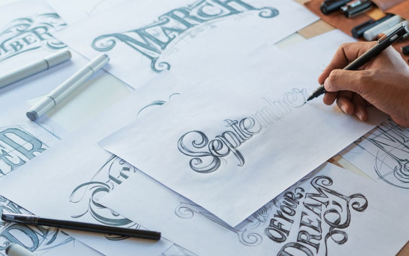
Typography is an often overlooked but crucial element in design that can make or break the visual appeal and effectiveness of a project. Whether you’re creating a website, a poster, a book, or any other design piece, the way you use typefaces, fonts, and type styles can significantly impact how your message is perceived.
Typography is not just about choosing pretty fonts; it’s about conveying information, establishing hierarchy, and evoking emotions. In this article, we will explore why typography matters in design, from the basics to its role in branding and identity, as well as its differences in print and digital media.
Typography Basics
Typography is the art and science of arranging type to make language visually appealing and readable. To understand why typography matters, let’s first delve into its fundamental elements:
- Typefaces: A typeface is a family of fonts that share a consistent design. For instance, Helvetica is a typeface, and Helvetica Regular, Helvetica Bold, and Helvetica Italic are different fonts within that typeface. Choosing the right typeface is essential because it sets the overall tone of your design. A playful script typeface might be perfect for a children’s book but entirely wrong for a legal document.
- Fonts: Fonts refer to specific variations within a typeface, like font size, style (bold, italic), and weight (light, regular, bold). These variations can convey different meanings and emotions. For example, a bold font suggests strength and importance, while italics can signify emphasis or a different voice within the text.
- Type Styles: Typestyles include attributes like alignment (left, right, centered, justified), line spacing (leading), and letter spacing (tracking or kerning). Proper use of these styles ensures readability and visual harmony in your design.
Selecting the right typeface for your project is crucial. It’s not just about aesthetics; it’s about matching the typeface’s personality to the message you want to convey. For instance, if you’re launching a new website for a law firm, a clean and professional serif font may be more appropriate than a playful, handwritten typeface.
Typography Hierarchy
Typography hierarchy is all about organizing content to guide readers through it effectively. It helps readers understand the structure of the information and find what they’re looking for. Typography hierarchy relies on several techniques, including:
- Font Size: Larger fonts catch the reader’s eye and suggest importance. Headlines and subheadings are typically larger than body text to indicate their significance.
- Font Weight: Bold fonts can emphasize key points or sections, creating contrast with regular text.
- Font Color: Using color strategically can further establish hierarchy. For instance, you might use a different color for links, making them stand out as clickable elements in web design.
Creating a clear hierarchy is crucial for websites, as website design experts know. It guides users’ navigation, helps them find the most important information quickly, and keeps them engaged with your content.
Branding and Identity
Typography plays a substantial role in shaping a brand’s identity and recognition. Think about iconic brands like Coca-Cola, Disney, or Google. Each of these companies has a distinctive typographic logo that instantly triggers recognition and conveys their brand personality. For instance, Coca-Cola’s curvy script font exudes friendliness and nostalgia, while Google’s clean and modern sans-serif font reflects simplicity and innovation.
When designing your brand’s identity, choosing the right typeface is as crucial as selecting the right color palette or logo. A consistent and well-chosen typeface can become an integral part of your brand’s visual identity, making it instantly recognizable.
Typography in Print vs. Digital
Typography in print and digital design has some similarities but also significant differences. Understanding these distinctions is essential for effective design in each medium.
- Print Design: In print, the typeface selection is fixed, and the designer has precise control over how the typography will appear. Factors like paper texture and printing methods also influence typography choices. Typography in print often emphasizes visual aesthetics, as there is no interactivity to consider.
- Digital Design: In digital design, the typeface must be web-friendly, ensuring that it displays correctly on various devices and browsers. Responsive design considerations mean that font sizes may need to adapt to different screen sizes. Interaction elements like buttons and links rely heavily on typography, requiring careful consideration of legibility and clickability.
In both mediums, typography remains a crucial element, but the specific considerations and constraints differ. Website design experts need to balance aesthetics with functionality and accessibility to create a seamless user experience.
Conclusion
In conclusion, typography is not just about making text look pretty; it’s a powerful tool for conveying information, establishing hierarchy, and creating brand identity. The right typeface can evoke emotions, guide readers, and make your design stand out. Whether you’re designing for print or digital, understanding typography basics and hierarchy is essential.
As you embark on launching a new website or any design project, remember that typography matters. It’s the silent storyteller that speaks to your audience, shaping their perception and engagement with your content. So, choose your typefaces wisely, establish a clear hierarchy, and let typography enhance the effectiveness and appeal of your designs.


